
Creating Prints
I have recently been enjoying making original art prints. The closest style of prints I could find to call these are Pochoir (French for stencil) Prints. I am not using the negative space of the stencil like you would if you were spray painting on to a service for example Banksy street art. This process you cut out the positive of the image you want to print and put paint on the cut out. I like this process because you can use multiply colors on the print and they each individual print that you make has lots of potential to be different from the other prints of the series but also have many commonalities.
Pochoir Prints
The first series I have been working on is the “Prime” Series, based around a hero archytipal charactar that reminds me of a comic book character. The image is a symbol of the characters head and goes along well with the the “Bewe” character that made its way into my paintings throughout the years. The comic book aspect seems to be a common theme for me. I was very much influence by comic books as a kid and still enjoy the imagery today. Not to be mistaken with illustration my art is definatly still absract by nature but has an elimant of a subject that you can hopefully relate to. Most of my inspiration comes from walking the fence line between abstract and art styles that you have a subject.

“Prime”
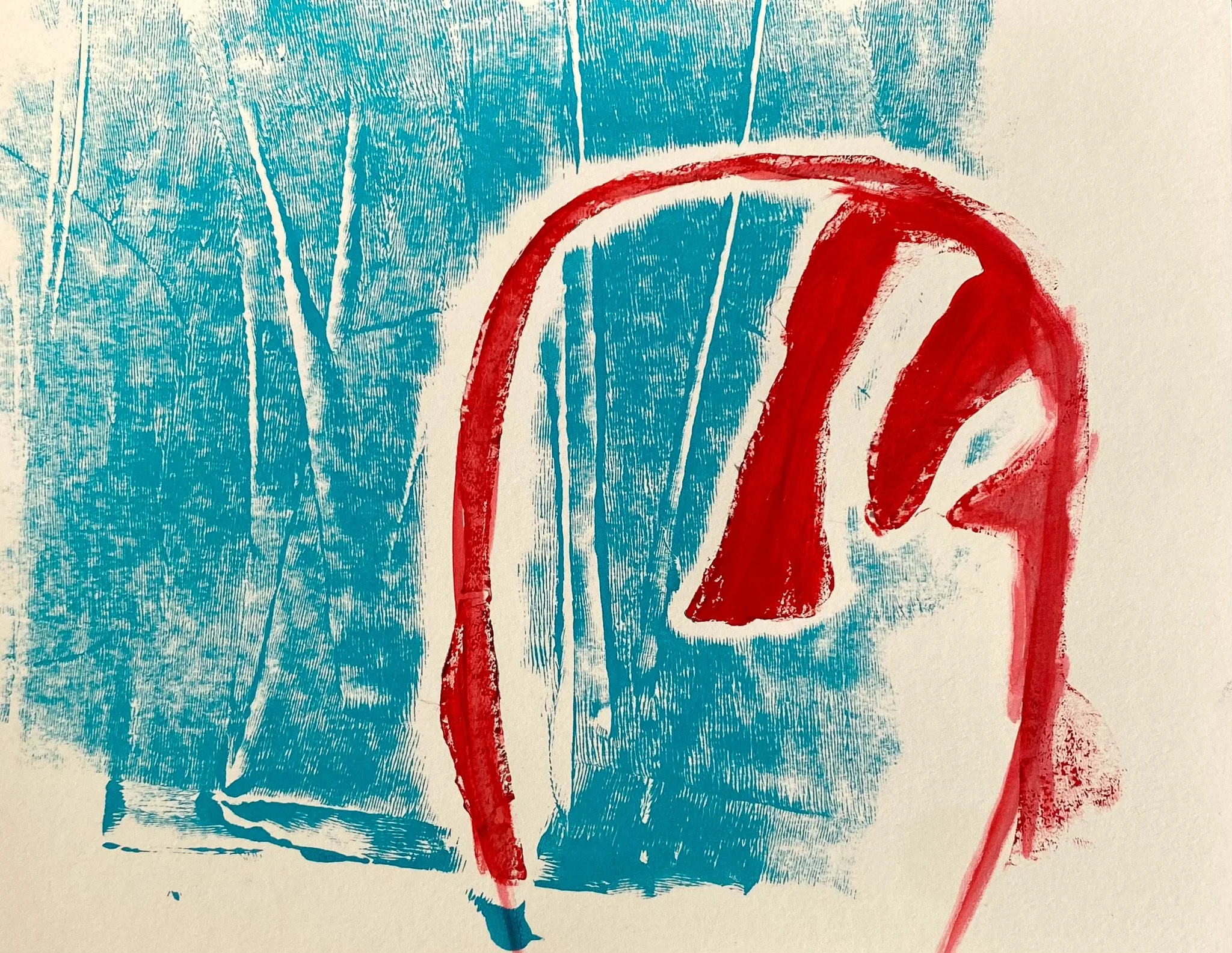
Another Type of Print
I have also been working on prints where I don’t use a stencil but instead I apply the paint to a surface then lay a a drawing down on top of the acrylic paint pressing the paper onto the paint to get the print on the original drawing. This process can make two to three nice prints from one application of paint. I have found that I like this way of putting some color onto a graphite or ink drawing.

Sitting Red Orange and Blue
The second print of the run you can see the resemblance between the two prints but at the same time they are very different. The second print is a ghost image of the first print. The first print was laid on top of an ink drawing and second on top of a graphite drawing. Both prints are on 18” x 24” paper.
Keep an eye out for more prints to come in the future I really enjoy creating series of artworks I think its because of the fun I had with collecting comic books as a kid

Sidenote about myself. The wonderful thing about comic books is that you with the minimal amount of words it gives space for your imagination to use the image as the gateway to your imagination. This mixture was perfect for me maybe because of my dyslexia I could read a little while still enjoying the story telling provided by the words, but using the pictures to drive my imagination.
This kind of explains why I enjoy abstract art to tell a story. I feel like the viewer would be able to dive into the image and dive into their imagination.

On the wall
a look at the print hanging up on the wall of my studio in Encinitas.